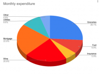
Pie charts are an essential tool in any charting toolkit. Pie charts are great for visualising percentages and proportional data. In this tutorial we will be creating a pie chart to represent monthly financial outgoings. We will see how the pie segments are labelled, and how the colours can be customised.
Related tutorials

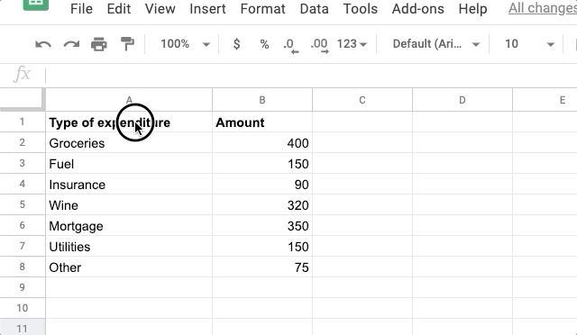
Step 1: Setup your sample data
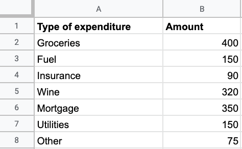
In a blank Google sheet, setup your data. In the cell A1, enter the name of your category, eg 'Type of expenditure', in B2, enter 'Amount'. Then fill in the different types of expenditure you would like to visualise under the heading in column A. Add the corresponding amount spent in column B.
Alternatively, you can open the starting spreadsheet which contains pre-populated sample data.
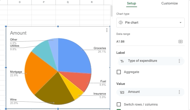
Step 2: Insert a new pie chart
Draw a selection box around your data from the top of column A, to where your data ends in column B. Then goto Insert > Chart.
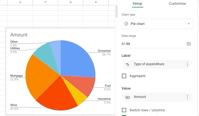
Step 3: Customise the color of a pie segment
In the chart editor, select the Customise tab. Then open the Pie slice section. Choose which item you want to change, and choose a color from the Color selector.
Note: If the Chart editor is not already open, double-click the chart to open it.
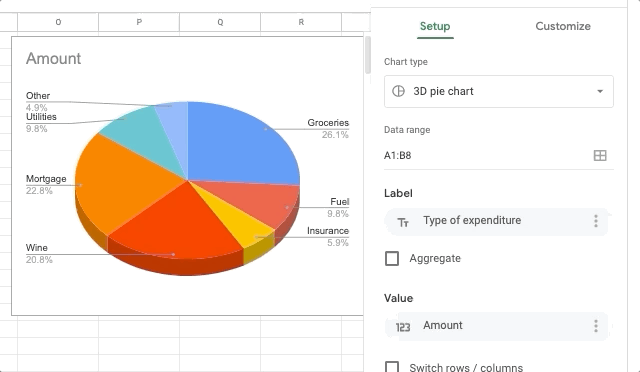
Step 4: Setting the pie chart to 3D
If you want to make your pie chart display in 3D format, open the Chart editor. Then click on the Customize tab. Next, open the Chart type section, and check the 3D option.
Note: If the Chart editor is not already open, double-click the chart to open it.
Step 5: Displaying the pie chart legend as a key
The default legend option is the call out label. To display the legend as a key, go to the Customize tab in the Chart editor. Open the Legend section and choose Bottom from the Position field.
Note: If the Chart editor is not already open, double-click the chart to open it.
Related tutorials