
Tutorial
Oct 10 2019
Bar charts are a great way to visualise your data. Google Docs has a variety of charts that can be easily added to your spreadsheet with just a few clicks. In this tutorial we will be creating a bar graph from some simple data.

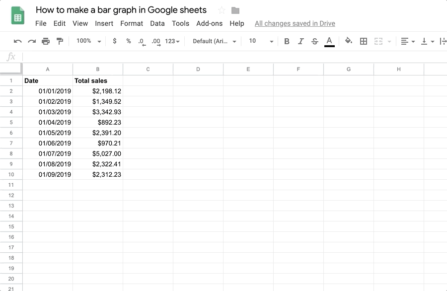
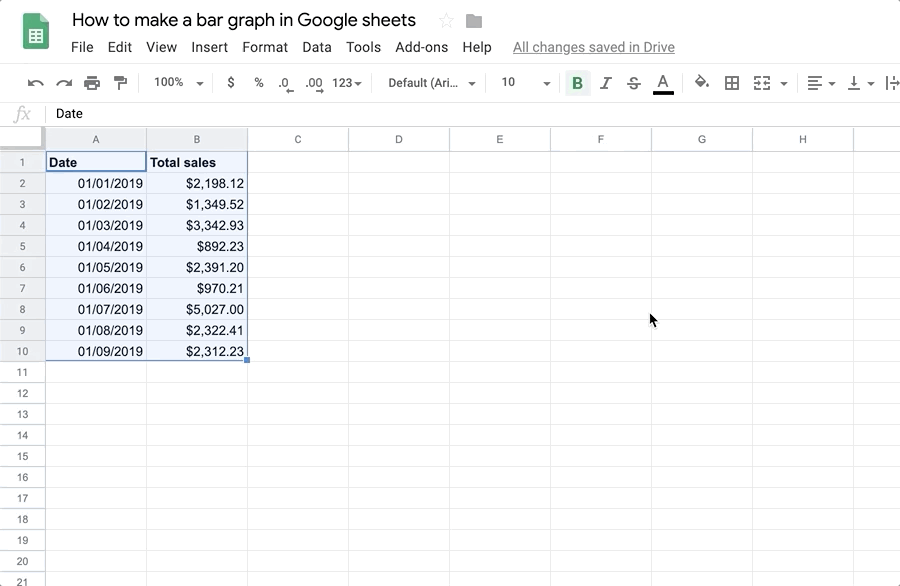
In your Google sheet, ensure that your data columns have suitable titles, then draw a selection box around the columns and rows you want to include in the graph.
Select Chart from the Insert menu.
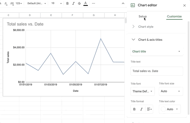
To change the chart type to a bar graph, double-click the chart to open the Chart editor, if it's not already open. Then select the Setup tab and choose the type of bar chart you want from the Chart type select field.
Related tutorials

Tutorial
Apr 26 2020