Geographic heat maps are used to visualise data sets by region or country. Google docs makes it very easy to create a heat map with its inbuilt Geo chart feature. In this tutorial we will be creating a simple geographic heat map from some sample data.
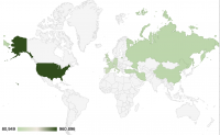
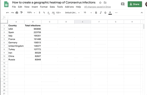
For this example we will be using the countries with the top 10 highest infections on 26th April 2020. The data for the number of Coronavirus cases is taken from the Worldometer Coronavirus data website.

Step 1: Insert a new chart
From the main menu, select Insert > Chart
Step 2: Set the Chart type to Geo chart
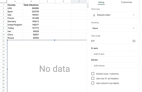
The Chart editor should now display in the right-hand panel. Select Geo chart from the Cart type select field.
To reopen the Chart editor, double click on the chart object on the page.
Step 3: Select the data range
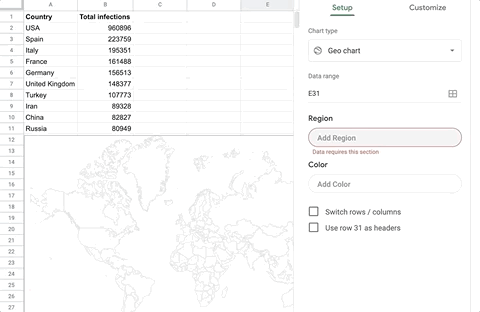
Click on the data range selector, and drag a selection box across your data columns.
Step 4: Set the max and min colors
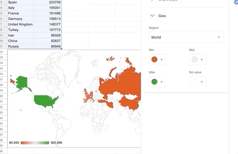
The default setting shows the highest numbers in green, and the lowest in red, which may not be suitable in this scenario. Here we are setting the min color to a light green, and the max color to a darker green.
Related tutorials